General Miles College Branding
Branding Overview
The following high-quality versions of official Miles College logos are available for download for use exclusively in official Miles College publications or communications, and must not be altered or manipulated in any way. Any usage of these logos for any purpose other than the creation of official publications of Miles College is a violation of copyright policy.
For guidelines on proper usage of the logos, please review the Brand Standards.
The Miles College Logo

The Miles College Logo
The Miles College logo is the most important and recognizable element of our brand identity. It is a graphic symbol that represents Miles to the outside world and acts as an identifying and unifying mark.
The following pages describe the available variations of the logo and rules for their use.
Primary Logo
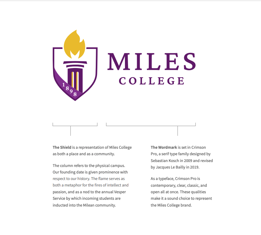
The Primary Logo is the preferred mark for use on all communications. It is best suited for left-aligned layouts.
Clear Space
To build recognition and ensure legibility, provide clear space equal to the height of the “M” when applying the logo to any communication. This will guarantee the logo is not obscured or clouded by other words, marks, or symbols.
Minimum Size
To ensure legibility, do not reproduce the primary logo at sizes smaller than 1.75in wide in print or 200px wide in digital applications. A small-scale version of the logo is available. See “Small-Scale Logos” on page 14 for more information.
Stacked Logo
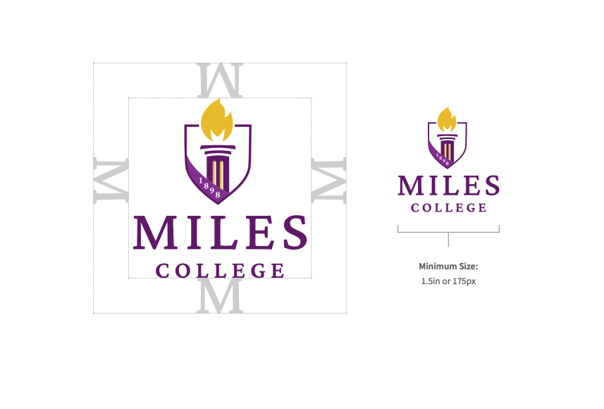
Where horizontal space is limited, or for centered applications, the Stacked Logo is most appropriate.
Clear Space
Provide clear space equal to the height of the "M" when applying the logo to any communication.
Minimum Size
Do not reproduce the logo at sizes smaller than 1.5in wide in print or 175px wide in digital applications.
A small-scale version of the stacked logo is available. See "Small-Scale Logos" on Page 14 for more information.
Horizontal Logo
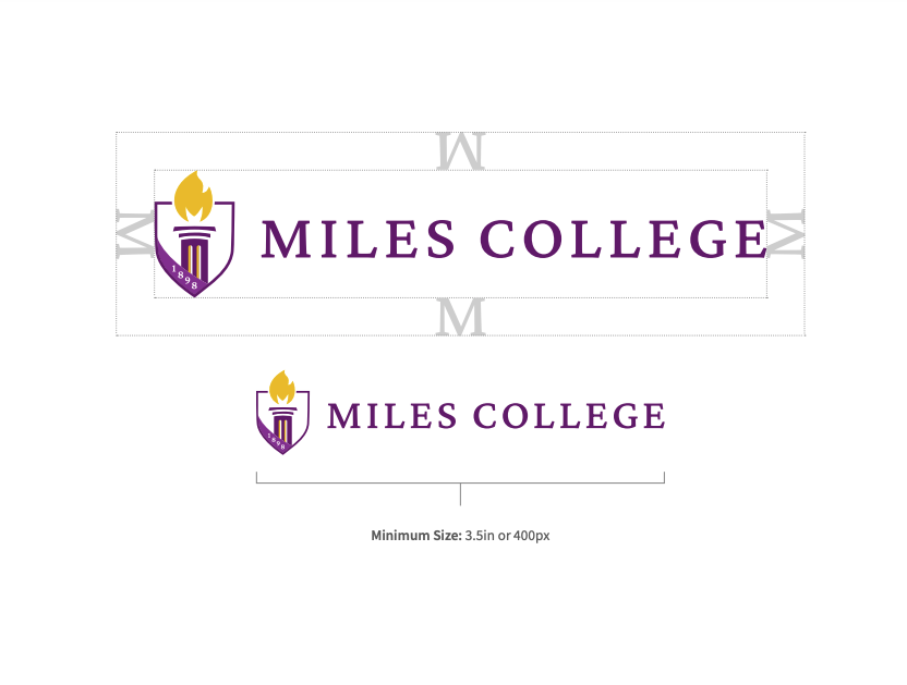
Where vertical space is very limited and the Primary Logo cannot be deployed while maintaining appropriate clear space, the Horizontal Logo is most appropriate.
Clear Space
Provide clear space equal to the height of the "M" when applying the logo to any communication.
Minimum Size
Do not reproduce the logo at sizes smaller than 3.5in wide in print or 400px wide in digital applications.
A small-scale version of the horizontal logo is available. See page 14 for more information.
Small-Scale Logos
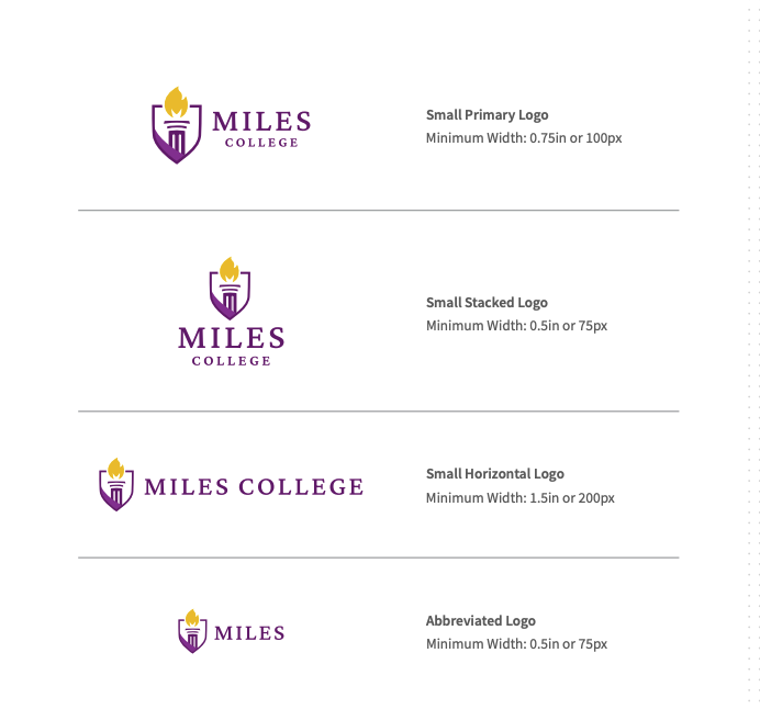
Where space is limited, designers may instead use the appropriate mark from the suite of Small-Scale Logos. These simplified designs allow for better legibility at small sizes. Social media avatars, business cards, pens, and other small collateral may require use of these logos.
Clear Space and Sizing
The clear space and color guidelines and that govern the full-size logos also apply to the small-scale suite. Only use these marks where logos must appear smaller than the minimum sizes prescribed for the full-sized suite on the previous pages.
Abbreviated Logo
Where space is extremelv limited. the Abbreviated Logo may be used. This mark exists only at small scale and should never be substituted where the primary logo can be properly deployed.

Miles College Spirit Mark
Color Variations
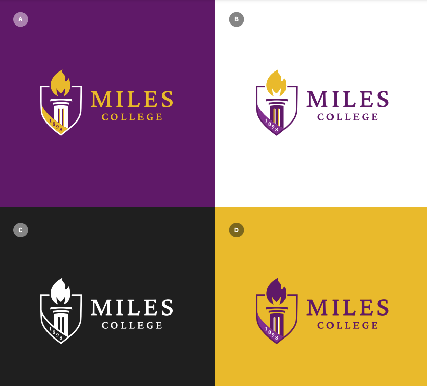
All logo lock-ups are available in four color variations as shown. The following guidelines
apply to all lock-ups.
Full-Color Logos
The full-color logos (A, B) are the preferred renderings of the Miles College logo.
Single-Color Logo
Use the solid logo (C) when full-color printing is not an option and for applications such as embossing, debossing, die-cutting or extrusion. Where photographic backgrounds would provide insufficient contrast with a full-color logo, the single-color logo may be used.
Reversed Logo
When the logo must appear on a field of gold use the Reversed logo (D) to maintain legibility.
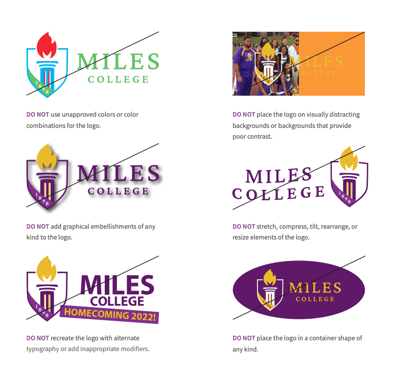
Incorrect Use
Correct and consistent use or the logo suite is an essential part of building and maintaining brand equity. While a great deal of flexibility has been built into the visual identity system, the correct use or each element has been carefully defined.
The examples shown here represent some but not all-of the ways that the Miles College logos might be used incorrectly. Any usage that obscures the logos or dilutes their recognition should be avoided.
Email Signature
The email signature logo should be use for its purpose only. This logo is not for merchandise uses or promotional advertisement.
For brand compliance and consistency, all email signatures should contain the employee’s full name, employee title, the college, department, phone number and email address.

The Miles College Spirit Mark
The Spirit Mark is the official Miles College athletic mark.
Guidelines
-
The Spirit Mark may be displayed on memorabilia sold by the Miles College Bookstore or all athletic teams.
-
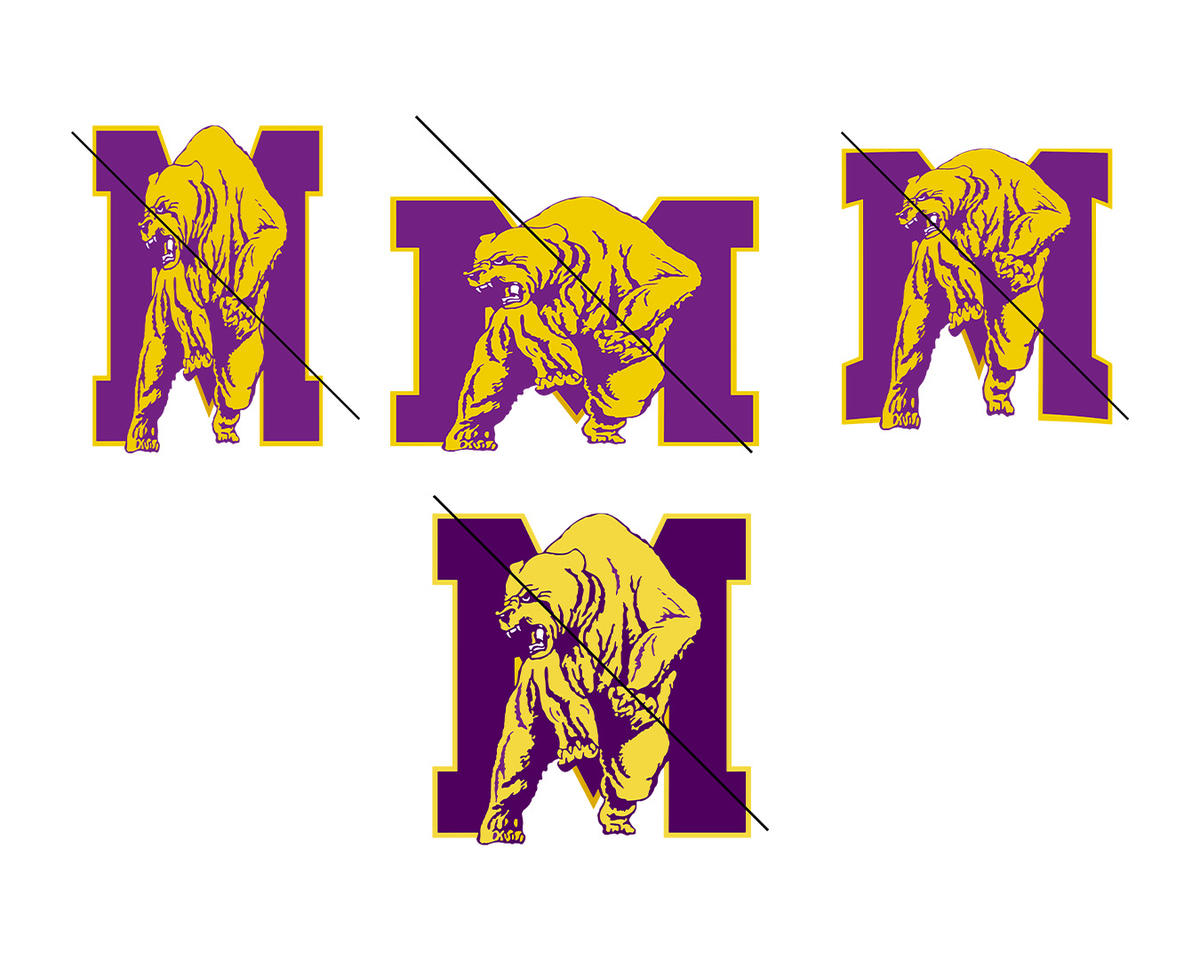
The Spirit Mark should not be reproduced on objects (such as trash cans) or in contexts that are demeaning.
-
The Spirit Mark is not interchangeable with the logo. Because the name of the institution is not prominent, the Spirit Mark should not be used alone for marketing purposes.
-
The Spirit Mark may be used in addition to the logo on printed or electronic communications, but should not substitute for it.
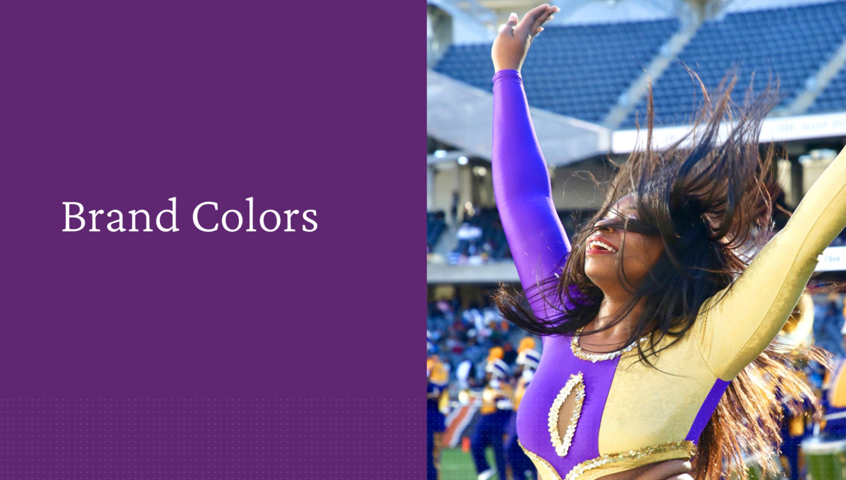
Brand Colors
Color Palette
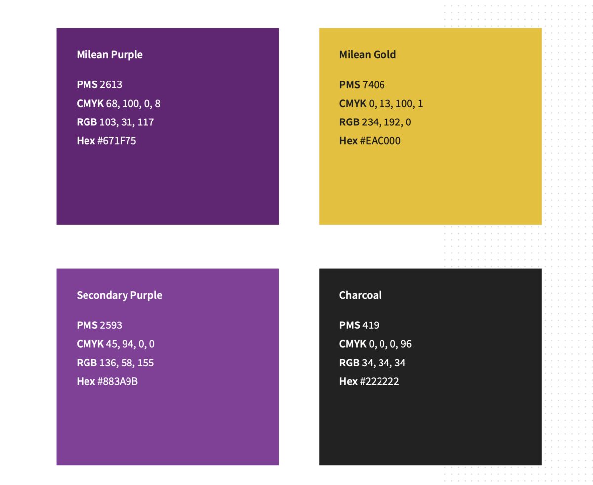
Use of color is key to presenting a consistent, ownable visual identity. Thoughtful use of the brand color palette links communications to the brand and allows creators to modulate communications for particular purposes and audiences.
Milean Purple and Milean Gold are the primary brand colors and should be considered as a starting point in all designs.
Secondary Purple should be used sparingly, only where light contrast with the primary brand purple is required, or as an accent color.
Charcoal is the brand black, for use in body text.
Always use the correct color formulas when developing new materials. This palette includes PMS and CMYK color builds for print applications and RBG and Hex codes for digital use cases.
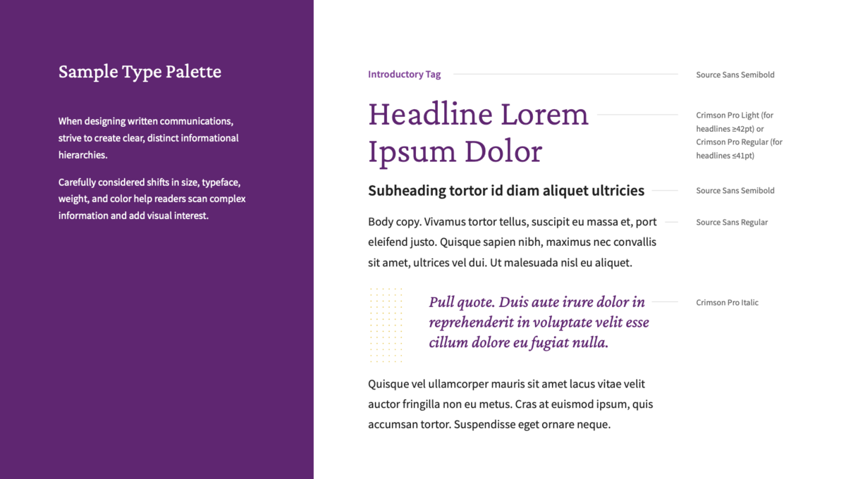
Brand Typography
Photography & Treatments
Photography plays a particularly important role in brand communications. It establishes a sense of place and spotlights the people at Miles College's heart. Its appropriate use promotes engagement and clearly communicates our mission and vision.

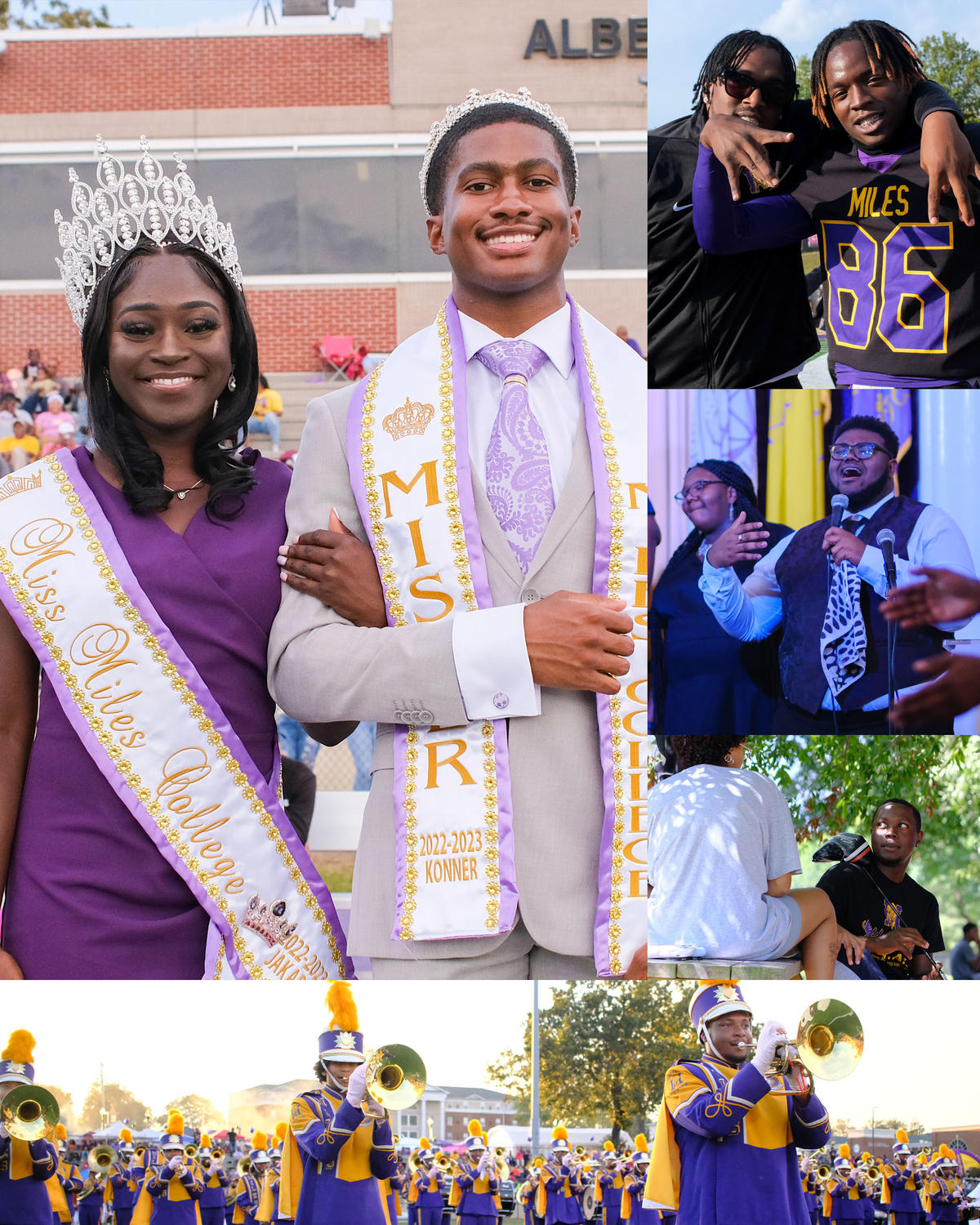
When selecting images, seek photography that feels dynamic, aspirational, and authentic - not unnaturally posed and stockv. Imagery should communicate the experience of campus life from an involved and inviting first-person perspective.
Photos must be high resolution.
Image Resolution: 300 DPI
Format: JPEG, TIFF or RAW
NEVER USE LOW-RESOLUTION IMAGERY, OUT-OF-FOCUS, POORLY LIT
Gradient Flame
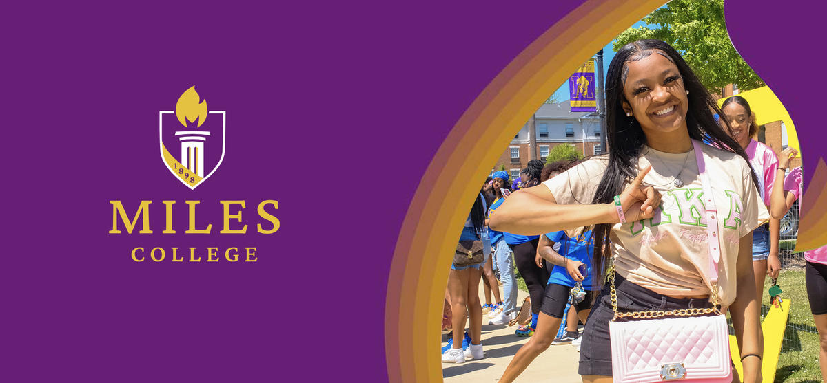
The Gradient Flame can be used to partially mask and add visual interest to an image on a background of Milean Purple.
Guidlines
-
Always use the provided Gradient Flame file. Both digital and print files are provided. Do not recreate the Gradient Flame.
-
Apply this treatment only to images with a single focal point, such as a portrait. Allow comfortable padding around your subject.
-
Align the Gradient Flame to the bottom-right edge of applications. The mask should completely cover the edges of the image.
-
Do not flip, distort, or reorient the mask. The Gradient Flame should always match the orientation and shape of the flame in the Miles College logo shield.
The Gradient Flame should not be used in total isolation. When placing the Gradient Flame, you may freely extend the purple background above and to the left in order to create comfortable space for logos, copy, etc.
However, take care that the Flame does not become too diminished in these applications. When in use, it should always be the dominant graphical treatment in a given piece of collateral.
Institutional Request Forms
Contact
For more general information and permission to access anything that relates to the Miles College brand contact: